Thursday, November 19, 2009

Autumn paintings 2009


Here are a couple of pieces I worked on this Autumn. I am going to work on the landscape some more (thinking about removing the barn and putting in more sky in it's place.) The still life is finished and I am quite happy with it. Still need to varnish it which will enhance the reflection on the table.

Thursday, October 8, 2009

Boston Museum of Fine Art


Recently, I visited the Boston Museum of Fine Art and thoroughly enjoyed what was around each and every corner. Standing in front of John Singer Sargent's "The Daughters of Edward Darley Boit" was like a religious experience, and I actually had a lump in my throat. You can see famous paintings time and again reproduced for you in a book or on line, but still nothing matches standing in front of the actual work. This piece was much larger then I ever imagined - it's practically wall-sized. Magically, the two large Chinese urns in the painting appear in real life flanking the painting. It's dark wood floors seem to extend onto the museums own dark wooden floors making the viewer feel as if they are standing in the room with these little girls. It's a heady feeling and a lovely one.

I also enjoyed viewing a another Sargent painting nearby that I hadn't seen before - "Rehearsal of the Pasdeloup Orchestra at the Cirque D'Hiver". It almost looks nothing more then a quick study, but the curves and the movement in it actually feel like the music the musicians must have been playing.

Another room I had trouble pulling myself away from (and came back to frequently) was the John Singleton Copley room. Here many of his find portraits hung including depictions of early American settlers. The most captivating piece though, again a wall-sized one, "Watson and the Shark". I was stunned and absorbed immediately with this dramatic work that insists on pulling you in to the terror filled scene. It even caused a rather horrific nightmare that night involving a hungry shark! Again, seeing this work in books versus standing in front of it holds no comparison. Everyone must see this work in person!

If there was one disappointing moment in my visit, it would involve viewing J.M.W. Turner's famous work; "Slave Ship". This is a very important piece which made a declarative statement on the heinous behavior between humans. Instead of being given it's due as a centerpiece, it was forced into a cramped corner with another work hung above it. This work should stand alone in a prominent place for all to view and study.

In a nod to the Chicago Art Institute, while looking at the Impressionist collection (small in comparison, but really enjoyable), the requisite heavy frames surrounding these delicate works caused a scalloped shadow to cast on many of the upper areas of the canvases, something I have never seen in Chicago. They either need to rehang or rethink the lighting in these galleries.

This museum is full of treasurers and some beautifully rendered rooms with thoughtful touches such as artist-rendered benches to enjoy the views and a rotunda with Sargent murals that make you dizzy looking up! Another favorite touch was a room painted in various soft gray tones mimicking mountains in the atmospheric distance. I hope to visit this museum again sometime.

Wednesday, September 16, 2009

Photo anomoly


Participated in a recent exhibition at our Village Hall and asked someone to take a photo of me with my work. I had forgotten my camera so they used my cell phone. Looking at the photo on the computer when I got home, I was struck by how the glare from the ceiling light ended up appearing as though there was a bright sun emanating from the corner of my painting!

Tuesday, August 11, 2009

Sculptured figure


Back in college, I created my one and only sculpture, and inspired by seeing the Rodin exhibit, I decided to post it here. The female figure is less remarkable then the process to make it.

1. Carved the figure out of stiff Styrofoam.
2. Buried the Styrofoam form in a bed of mud and motor oil with the mud firmly packed around it.
3. Let it dry and harden with a long metal tube meeting it in the mud, and the other end sticking out.
4. Poured melted aluminum down the tube to the Styrofoam form, melting the Styrofoam. The aluminum filled the space where the Styrofoam once was.
5. Let the aluminum cool a couple of days and then dig out the sculpture.

Can you tell I was a fan of Henry Moore?

Sunday, August 2, 2009

Rodin Exhibit


Went downtown Saturday with some friends on the train, with plans that included seeing the Burnham commemorative sculptures and visiting the Loyola Museum of Art for a visiting show of Rodin's sculpture.

I was very dismayed to visit the Burnham White sculpture at Millennium Park, because I was so enthralled with it during my first visit. It looked in terrible condition and there were signs everywhere saying "Please do not climb on sculpture" Apparently some miscreants had been climbing on the various soft curves, eroding the materials and chipping away the skin of the sculpture. The neighboring sculpture was surrounded by construction fence and all sorts of building materials and looked equally a mess while workers continued installation. Not the right day to show your friends what you thought would wow them.

Instead, we grabbed a cab and took off for LUMA at 820 N. Michigan Avenue, which turned out to be next to the historic Water Tower that survived the Chicago Fire. There's a pretty little green park and modest fountain there and parking for horse and buggy rides which were constantly pulling up on the small divided avenue. The Loyola Administration building, with a beautiful facade, lies just west of this peaceful space, and next store, oddly out of place, is a crowded Hershey's Chocolate store. We climbed the dozen steps inside to find a very modern space and the entrance to the museum along with a modest gift shop. The entry fee is only $6 (a bargain compared to The Art Institute) and the price suits the modest size of the museum.

The exhibit consisted of roughly 25 pieces. Several sculptures were heads or "masks" as Rodin refers to them, and there were two alarmingly large full figures - both holding palettes (see picture I managed to shoot with my cell phone before I was told no photos allowed), and a pair of hands (one of an adult, one infant sized.) The most striking to me were the many male figures in various poses. The really intriguing bonus of this show, which is called "In his own words" is that each sculpture was accompanied with a paragraph by Rodin explaining his motives, feelings, public reaction to his work, and his aesthetic.

Rodin wrote about how he purposely pumped up and slightly exaggerated each muscle and hyper stretched and extended every limb to exude life and energy within. He was thoughtful about where light would hit each fractured surface on his sculpture. This really added to the feeling of power and movement. His work revealed a very different portrait as you walked around it. I was especially entranced with how beautifully he could portray the arched bottom of a foot - it expressed so much about the figure. There was a replica of "The Thinker" there, but my favorite was "I am Beautiful", a strong figure of a male lifting a female high and close so her legs are curled under her - it's an unusual and beautiful pose.

In the rooms beyond was an interesting photography exhibit with photos of both Parisian and Chicago architecture. I must say Chicago holds it's own! Upstairs, in lovely deep jewel colored rooms are a very nice collection of Renaissance art - definitely worth the trip to the second floor.

Thursday, July 30, 2009

Three Ladies


Working on a new landscape I am calling Three Ladies. Somehow these trees strike me as rather feminine and they seem to have befriended one another in the way their branches cross and intertwine.

This is an 18" x 24" linen canvas. I am using a limited palette of Zine White, Lemon Yellow Light, Alizarin Crimson and French Ultramarine Blue. I am sticking with fairly large brushes with the exception of a small round for the branches. It all feels very modern to me and I want to limit the detail and stick with color as the main interest.

Sunday, July 26, 2009

Studio Envy!


Just got back from a weekend away in South Haven, MI and enjoyed walking in and out of many art studios in the area. The picture here is of an artists' studio down a country road, off into the forest. It's everything an artists studio should be ~ outside; lots of color and flowers and surrounded by lovely woods; inside paintings scatter shot everywhere and inspirational images pinned to the walls. Lots of big windows with views of the woods and plenty of room to have several canvases going at once. Oh, how I envied this wonderful creativity-inducing space. Maybe someday!

Also picked up a nice wood gold gilt frame at an antique shop for $20, in good condition, sized for an 8" x 10" canvas. Currently it holds a cheesy dated print, which I will probably discard.


Played around with my Sakura watercolor set both at the beach and at breakfast on the wrap-around porch of the old Victorian where we stayed. Here is an amateur attempt at a shed across the drive, covered in grape-vine. The water chamber brush takes some getting use to when it comes to controlling the moisture. Need more pratice, but it's a practical portable toy for travel, when the spirit calls for some creativity!

Took lots of nature photos this trip which will hopefully yield some good reference photos down the road for paintings.

Wednesday, July 22, 2009

Young Son Done


Finished portrait of my son. This was a tough challenge and I really struggled. The flesh tones were not as difficult as the features were. I struggled with the eyes and I think that's partly because my photo was of poor quality. In the end I decided I needed to put a conventional eye on his right side instead of the shadowy one in the photo in order for it to read better as a portrait. I may work his lips a little more and am debating whether his upper eye lids need to be closed more. I am satisfied that this portrait bares a strong resemblance to my son. I am setting him aside for now and moving on to a landscape.

Am trying a linen canvas for the first time and am anxious to see if I notice a difference. The reference is a photo I shot at a nature center of three leafless (dead?) trees standing side by side. I call them "the three ladies" because they have an elegance in their bare silhouette that I look forward to capturing and the colors are kind of surreal as the photo was snapped just before dusk. Looking forward to a looser style after the tightness and intense concentration a portrait requires.

Adding close-up of eyes after a glint was added!

Sunday, July 12, 2009

A Day at the Art Expo

Attended the Art Expo in Lisle, Illinois yesterday with two wonderful artist buddies. It was a beautiful day and a lovely drive to the Hickory Ridge Marriott. Check-in was a breeze (with pre-registration) and we were given an extra-large "green" goodie Blick bag for all the purchases and freebies we amassed during the day.

The first room we drifted into was the Candy Store, and by that I mean the vendor room where all the art supply vendors were selling their wares at discounted prices. As we three all use different medium, we drifted apart as different "candy" caught our eye. Many booths really dazzled including a new pastel product I hadn't seen before. Instead of the usual pastel sticks, these pastels come in little round pans. The colors just blew me away. They looked like little pots of gorgeous make-up and I wanted to play. The tools to paint with them equally look like cosmetic applicants and were wonderful to work with. In an outdoor tent they had a "play" area where I could test them out and really had a great time. The gals had to drag me away! A girl could get seriously hooked on these and they are pretty affordable and last a long time. The nice thing about the sponge-tips tools is they save the skin on your fingers when blending. To check them out, visit PanPastel.com. They are available at Dick Blick and run about $4 per pot and are long lasting with minimal dust factor.

All art books were on sale half price, and always being a sucker for books, I bought two - Fill Your Oil Paintings with Light & Color by Kevin MacPherson and The Painterly Approach by Bob Rohm. Read the first one last night, (well, flipped through it mostly) and really enjoyed it - lots of good tips and color ideas. Particularly liked the "mixing sensitive Grays" section - doesn't that sound marvelous?! Also took advantage of the low prices to try a linen canvas for the first time and splurged on some attractively priced boar bristle brushes hoping the hair won't be falling out of the shank anytime soon (because the prices seemed too good to be true (did I say that out loud?). The man who sold them to me said if they did, just to bring them back next year and he would replace them for free - guarenteed! We'll see. Also bought (partly because it has high cuteness factor) the Koi Water Colors Pocket Field Sketch Box with 24 colors and water brush. So handy for travel.

Having skipped breakfast, we went in search of a cheap option for lunch and found one in a hotdog/hamburger stand inside the outdoor vendor tent. After grabbing food, we joined a nice gentleman at a table (due to a seating shortage) and he turned out to be the nicest guy who is a watercolor artist/cartoonist from Michigan City, Indiana. He creates gamers comic books including "Knights of the Dinner Table"! Always join a half full table because you are bound to meet interesting people.

Prying ourselves away from the vendor booths, we rushed to our one workshop we had signed up for ~ "Creating Portraits" with Len Gason. Turns out Len was a no-nonsense guy (oh dear) who "hushed" us repeatedly - which frankly was a bit of a turn-off - aren't we there to learn and have fun? His handouts were a bit lame, but he did give some useful tips on composition and values. A bit of an absent-minded, disorganized professor, as he continually had to hunt for items when trying to make his point ("Where did I put that darn Mona Lisa?!!!?"). Using Gouche (my first time) we did a color value study of John Sargent's (as he called him ~ I personally always include the Singer) James Joyce portrait. To varying degrees our portraits turned out looking like anything from Dr. Phil, to Uncle Ben (he of the rice box) to The Mummy. Still it contained some valuable lessons, though I am not sure the workshop was worth the $75 pricetag.

To end our day, we headed back to the vendor tents (like moths to the flame) to collect our purchases and play a little more with the materials. I also watch (a nerve-wrecking) 5 minute portrait contest between 3 artists on stage with a model, working with just three stick pastels in the most hidious neon colors. First prize was a $50 gift certificate to Dick Blick and the winner, while sparse in detail versus the other two contestants, definately best captured the subject. She also had some pretty rowdy friends in the audience cheering her on.

At the end of the day, we collapsed in a heap in the cushy lobby to compare our loot. I was a little green-eyed over a landscape sketchbook that was beautifully proportioned for panaramic scenes. We all concurred it was a good day and we were ready for a McDonald's drive-thru for some much needed caffine for the drive home.

The expo was lots of fun and the lessons learned for next year are these; 1) save your money for the trip, 2) get more info about a class and instructor before you register and 3) don't buy art supplies for months leading up to the show and make a laundry list of what paint colors you need refills on- because you are not going to remember once at the show! Overall ~ worth the trip!

Monday, June 22, 2009

Young Son's portrait - Day 3


Here is my posted progress on my son's portrait. There are many challenges still to solve. I need to move his eyes lower, work out the background and shoulders, develop the (viewers left) side of his face and many other challenges, but I am happy with the way he is coming along. Areas I am happy with include his hair, lips, the right side of his face, and flesh color choices. He is becoming very dimensional to me as I look at him on canvas.

Modern Wing; Art Institute

Friday on my B-Day, my patient husband took me downtown (in the driving rain - our pants and shoes were soaked walking to the station!) by train to see the new Modern Wing at the Art Institute.

We took a cab to the front door and entered the traditional way - though I can see that entering on the North side by the new bridge would have been a very dramatic entrance. The price now for entry is $18, but coat/umbrella check is free. This includes the Modern Wing. You walk back through the long gallery (used to be full of armor and weaponry, but now has ancient Asian sculpture and such) to the end and then turn left to these huge glass double doors (really extraordinary floating doors that open much easier then their size would suggest).

Then, you enter a whole new space that really takes your breath away. It is full of light and air with floating staircases and lots of vertical lines. It's the main hall in this new space and all the galleries to view the works are off to each side. There is an order in which you view the works. If you want to start chronologically (which we didn't and I regret), you would climb to the third floor first to view the earliest of the modern art for the beginning of the 1900's. You must begin at the north end each time (there are guards at the south end who won't let you enter so their intention is to control flow so you see the work in a certain order). Then you descend the floating staircase to the next floor. At the north end of each floor are EXTRAORDINARY views of Millennium Park and the city. Views that you will have never seen before and that really rival for your attention against the artwork and is arguably more captivating then the artwork itself.

The Work. Modern Art jolts you, makes you think, annoys you, angers you, lifts you, informs you, confuses you, scares you and on rare occasion offers beauty to behold. This is how I felt as I walked through each gallery. While many pieces I recognized like Dali, Brancusi, Magritte, Lichtenstein, Warhol, Man Ray, Picasso, Matisse, Jackson Pollack, there were many I was unfamiliar with. The husband balked at works that he felt a kindergartner could easily do. Prepare to go with an open mind and put the work in the context of the times they were created. It would also help to educate yourself on modern art. I drew on my art history classes back in college so I had a very base knowledge.

After walking the Modern Wing, we grabbed some lunch at the cafe and then my husband felt the strong need for some equilibrium and comfort so we walked through the French Impressionism gallery - quite a stark contrast! It looks beautiful and I am wholly enamored with the two giant Vuillard works on exhibit, but somehow I feel like they have suppressed much of the French Impressionistic work - not sure if it's on loan or in storage.

After we left the Museum we turned north and headed to Millennium Park to see the new works on exhibit. By this time the sun had come out (and the humidity was intense!) There is a new installation that commemorates the Burnham Plan. These are the Burnham Pavilions - see link:
http://burnhamplan100.uchicago.edu/history_future/burnham_pavilions

Only the Pavilion by UN Studio was complete, and it is really something special to walk through. It had an uber modern feeling to it. It had beautiful soft curves and allowed you to view the city in different eye shaped forms as you walked through it. The space invited people to stop and engage with each other in conversation. I really loved it and it's temporary - only through October, so go see it! There are other secrets about it, that I won't share - you should experience them personally. The other Pavilion is still in it's skeletal stage, but it will be equally worth seeing once it's complete.

Hope you enjoyed this review. I feel very fortunate to live near a City of Art?

Thursday, June 11, 2009

Young Son's portrait


Second day's work on young son's portrait. I had read about a formula for skin tones on line and decided to try it: White, Cad Red Light, Cad Yellow Med, Yellow Ochre and Burnt Sienna. It suits his skin tones which are warm and brown, but I am finding this limited palette a bit dull.

I was watching a special on PBS last night about the Da Vinci painting, Ginevra de' Benci. A luminous beautiful portrait of a girl. I was fascinated by her skin tones and when I really studied them, I noticed touches of very light pale blues and greens used for highlights on the upper checkbones and the eye lids. It made me wonder if this is what created the luminosity. I don't know that this would be suited for my son's portrait due to the heavy role shadow plays, but will try it on another work of a young infant girl I am trying to finish, but have yet to be satisfied.

Sunday, June 7, 2009

Burr Oak Completed!


Finished (aside from a few tweaks still to come) Burr Oak Portrait on 40" x 40" canvas. Great experience painting a large canvas. Forced me to step WAY BACK a lot. It's a love poem to trees everywhere.

Monday, May 25, 2009

Painting St Johns Church


On Saturday, a group of 9 artists went to paint plein air at St. Johns Church. St. Johns dates back from the mid-1800's and is a lovely little church, nicely preserved on 3 quarter acres of land. There is a walking grass labyrinth on the grounds as well as a wooded outdoor area set aside for church services when weather allows.

The weather was sunny and warm, with plenty of shade trees to stand under while painting. Everyone found their spot and set up easels.

My mistake was taking too large of a canvas along, so I didn't get very far in my work, but plan to finish it and will post when it's more complete. The church with all it's angles and windows proved very challenging. Most of us chose to stand on the shaded side of the church so showing the shaded side with the sun hitting just a few spots was an interesting exercise. The critique after (we leaned our work around a broad tree) was valuable, and we all came away pretty happy from the experience.

I struggled with my colors getting too muddy on the palette - not sure why that was an issue this time, I had a Whistler like painting in mind - a tonal painting, so maybe that's why I got mud instead! The day was probably too sunny for tonal anyway so I will have to rethink my approach. Thus far, my plein air experiences have been more focused on nature, so a building was much tougher. Very glad I tried this though and learned from watching other artist's approach.

Tuesday, May 19, 2009

Thoughts on Subject Matter


I am always thinking about painting. Currently my mind bounces from portrait work to landscapes.

Here is the beginning portrait of my younger son, but am also working on a large landscape of a Burr Oak which is in a much more completed state. I am itching to get back to it but can only work it on weekends as it is stored off site due to it's size.

Driving home from work every day or looking out the window, I study trees for their colors and shapes. I strain to see every color I can find and identify them as some would search for birds! The mental debate; do I want the tree to hold equal emphasis on the canvas with the landscape around it (ala Vulliard, whose large canvases recently inspired me at the Art Institute) or make the Burr Oak the absolute center of attention.

I am painting plein air on Saturday morning at St. John's Church and am looking forward to trying a tonalistic style.

Saturday, May 16, 2009

Portraits Challenge 2009


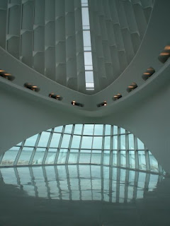
Portraits are one of my chief 2009 artistic challenges. They are difficult, challenging, frustrating and inspiring. A great mental exercise! My preparation has included buying Rembrandt The Painter at Work by Ernst Van De Wetering and attending the Jan Lievens (a contemporary of Rembrandt) exhibition at the Milwaukee Art Museum. (What a little gem of a museum! The architecture is awesome - like a beautiful pristine white ship on the gray/blue lake (see photo above) ~ and the cafe down below is a romantic treat.)

Rembrandt The Painter At Work has many beautiful close ups of details such as eyes, noses, lips and hands which I find useful to study. The Jan Lievens exhibition was inspiring. His skin tones, hands and various fabrics were so exciting to view up close. One technique I learned in the exhibit is that he would paint the flesh color and then paint facial hair on top and using the back of his paint brush, he would scrape away the top color paint to expose the flesh color underneath - a wonderful, useful technique. I forgot to use it on my first portrait though! Hopefully, I'll remember next time.

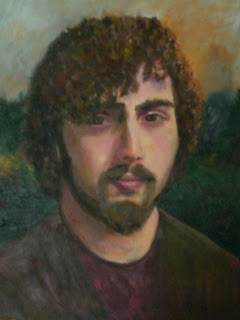
Above is my first portrait - it's a painting of my oldest son. Still tweaking it here and there, but it's essentially done. I am pleased with this first effort. Additional tips I learned;
  • When painting lips use a "W" shape at the bottom of the bottom lip, and don't make a solid line for the lip, allow flesh color to show on the lip line in places.
  • Use your brush strokes to shape each area (i.e. curve your lower lip with a "c" shape brush stroke).
  • Nostrils should be painted in warm tones.
  • Change brush sizes so your whole painting isn't done in one brush width.
  • Put cool color in hair where it meets warm skin tones.
  • View your painting in the mirror to check for errors.
  • Measure, measure, measure!(How many times does the chin fit in the rest of the face, how many times does the eye fit across, etc)
  • Put a dark background behind the light side of the face, and the reverse behind the dark side of the face (still not sure why this works!)
  • Avoid white as much as possible as it makes your work chalky.
  • Naples Yellow, Violet and Moss Green have proven to be invaluable in flesh tones.
I have already begun a portrait of my younger son and hoping all the lessons from the first will benefit the second.

Paintings Around The Pond


Today was a very proud one for me when a question that was posed one snowy winter day in 2007, was finally answered. That day, Forest Ranger Sue asked me if the Hoffman Estates Art League would like to paint some panels representing the Crab Tree Nature Center for the Turtle Habitat in the Interpretive Center. Bob and I were painting indoors that day and the idea immediately appealed to us.

Three other wonderful artists signed on and one warm summer day we all went out for a walk at Crab Tree, cameras in hand, searching for our favorite spot to portray.

We completed our oils (and one acrylic) in October and then they had to "cure" for 6 months before they could be varnished. Then the wonderful people at Crab Tree set to work on the installation.

Today was the unveiling and the result was beyond my wildest dreams! This is our groups second public art work installation, and we are hooked on the whole idea. I am even cooking up our next project! Stay tuned.

Tuesday, May 12, 2009

Entering The Blog World

Decided to start a blog because my internal dialogue is very strong during the creative process and seeing it typed out on the screen would be like watching a painting being born through thought. My work has been called poetic and painterly by others and I have been told that I paint what I feel rather then what I see. Hoping this blog, when I read it back, will provide insight into my artistic motives and help me grow as an artist.