
Portraits are one of my chief 2009 artistic challenges. They are difficult, challenging, frustrating and inspiring. A great mental exercise! My preparation has included buying Rembrandt The Painter at Work by Ernst Van De Wetering and attending the Jan Lievens (a contemporary of Rembrandt) exhibition at the Milwaukee Art Museum. (What a little gem of a museum! The architecture is awesome - like a beautiful pristine white ship on the gray/blue lake (see photo above) ~ and the cafe down below is a romantic treat.)
Rembrandt The Painter At Work has many beautiful close ups of details such as eyes, noses, lips and hands which I find useful to study. The Jan Lievens exhibition was inspiring. His skin tones, hands and various fabrics were so exciting to view up close. One technique I learned in the exhibit is that he would paint the flesh color and then paint facial hair on top and using the back of his paint brush, he would scrape away the top color paint to expose the flesh color underneath - a wonderful, useful technique. I forgot to use it on my first portrait though! Hopefully, I'll remember next time.
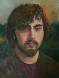
Above is my first portrait - it's a painting of my oldest son. Still tweaking it here and there, but it's essentially done. I am pleased with this first effort. Additional tips I learned;
- When painting lips use a "W" shape at the bottom of the bottom lip, and don't make a solid line for the lip, allow flesh color to show on the lip line in places.
- Use your brush strokes to shape each area (i.e. curve your lower lip with a "c" shape brush stroke).
- Nostrils should be painted in warm tones.
- Change brush sizes so your whole painting isn't done in one brush width.
- Put cool color in hair where it meets warm skin tones.
- View your painting in the mirror to check for errors.
- Measure, measure, measure!(How many times does the chin fit in the rest of the face, how many times does the eye fit across, etc)
- Put a dark background behind the light side of the face, and the reverse behind the dark side of the face (still not sure why this works!)
- Avoid white as much as possible as it makes your work chalky.
- Naples Yellow, Violet and Moss Green have proven to be invaluable in flesh tones.

No comments:
Post a Comment